The Royal Institution (RI) is a historic venue where some of the greatest minds in science—including Michael Faraday—once captivated audiences with their groundbreaking discoveries. It’s the perfect place to explore one of the deepest questions in cosmology: Where did our Universe come from?
Rethinking the Big Bang
In this talk, I’ll take you through the fierce scientific debates over cosmic origins and reveal how modern cosmologists are challenging the traditional Big Bang narrative:
🔹 Was the Universe born from a black hole?
🔹 Does time extend before the Big Bang?
🔹 Could our cosmos be part of a vast multiverse or an eternal cycle of rebirth?
🔹 And much more!
Science isn’t just about equations—it’s about people, rivalries, and radical ideas. Join me and Phil Halper for a journey through the evolving frontiers of #cosmology and the very human quest to uncover our true origin story.
At PI, a theoretical physicist named Dr. Henrietta Grudge was renowned for two things: her razor-sharp critiques and her reluctance to entertain “frivolous” ideas in physics. “No muffin is free!” she often declared, decreeing austerity measures in PI’s famously generous perks, even proposing to downgrade the coffee from Illy to instant.
Henrietta had no time for speculative theories. String theory? “Tied in knots.” Loop quantum gravity? “Loopy.” And don’t get her started on multiverses—“lazy storytelling for physicists who binge-watch too much science fiction.”
On December 25th—Newtonmas, as it was fondly called by the physicists at PI—Henrietta sat alone in her office. While others joined in celebrations with apple pies (Newton’s favorite fruit), billiard ball tournaments (a nod to Newtonian mechanics), and spontaneous debates about causality in quantum mechanics, Henrietta was hard at work. Not on research, mind you, but on drafting particularly scathing referee reports.
“Why is every paper these days about black hole thermodynamics? Just let the black holes stay cold and quiet! Reject!” she muttered.
Suddenly, her screen flickered, and the ghostly face of her old PI colleague appeared in the glow of her monitor.
Enter the Ghost of PI Past
“Henrietta Grudge!” boomed the apparition. “I am the Ghost of PI Past, here to show you what PI once was—and what you have forgotten.”
Before she could protest, Henrietta was whisked to an earlier era of PI, where the corridors buzzed with excitement. She saw her younger self, scribbling equations with joy alongside eager colleagues. Back then, free muffins and free coffee were all over the 4th floor bistro, and ideas were as limitless as the cosmos.
“You once loved wild, speculative ideas,” the Ghost said. “Remember when you explored Horava gravity, just for fun? When you laughed at the idea of black hole firewalls but secretly admired their boldness?”
“That was before everyone started submitting ridiculous papers about ER=EPR!” Henrietta snapped.
The Ghost shook its spectral head. “You’ve grown cynical, Henrietta. And you’ve forgotten the spirit of PI.”
Enter the Ghost of PI Present
As Henrietta returned to her office, still grumbling about Lorentz violation, a second figure appeared. It was the Ghost of PI Present, dressed in a dark formal suit.
“Come with me!” it said, dragging Henrietta to the Black Hole bistro, where a heated debate about dark energy was underway.
The Ghost gestured toward a group of students discussing whether space-time could be emergent. “Do you see their excitement? The spark of discovery? That’s what PI is about!”
“But they waste resources!” Henrietta argued. “Do you know how much free muffins cost annually? And those spacetime foamy cappuccinos? Outrageous!”
The Ghost raised an eyebrow. “Do you know how much free thought costs annually? Zero. Because it’s priceless. You’re stifling this creativity.”
Enter the Ghost of PI Future
The clock struck midnight, and Henrietta was visited by the most terrifying ghost of all—the Ghost of PI Future. A hooded figure, it pointed silently to a desolate scene: PI, a shadow of its former self, the blackboards erased, the bistro empty save for a sad vending machine with stale energy bars.
“Is this what happens if I cut the muffins?” Henrietta asked, horrified.
The Ghost said nothing but gestured to an epitaph etched on the blackboard: “Here lies the spirit of curiosity, killed by cost-cutting.”
Henrietta’s Transformation
The next morning—Newtonmas Day—Henrietta woke up with a start. She flung open the door of her office and shouted, “Bring back the muffins! Double the Illy coffee supply! And someone order more blackboards!”
She joined the Newtonmas party, surprising everyone by presenting a gift to the students: a blackboard filled with speculative equations about an entirely new theory of quantum gravity, that could be tested using gravitational wave observations. “Let’s see where this goes,” she said with a grin.
From that day on, Henrietta became the greatest champion of new physics at PI, always willing to entertain the wildest ideas, and never again did she draft a scathing referee report on Newtonmas Day.
And, as every physicist at PI might say: “She was as good a theorist, as good a colleague, and as good a muffin-provider as the world of physics had ever known.”
I am thrilled to announce that, after many years of writing and rewriting alongside my dear friend and science communicator par excellence, Phil Halper, our popular science book:
is now available for pre-order through the University of Chicago Press and your favorite online retailers (links below).
We can’t wait to take you on this incredible journey through the cosmos, sharing the tales of our cosmic origins in a way that’s captivating for both science enthusiasts and everyday readers alike. We look ahead to inspiring curiosity and excitement about the wonders of our universe! 💖
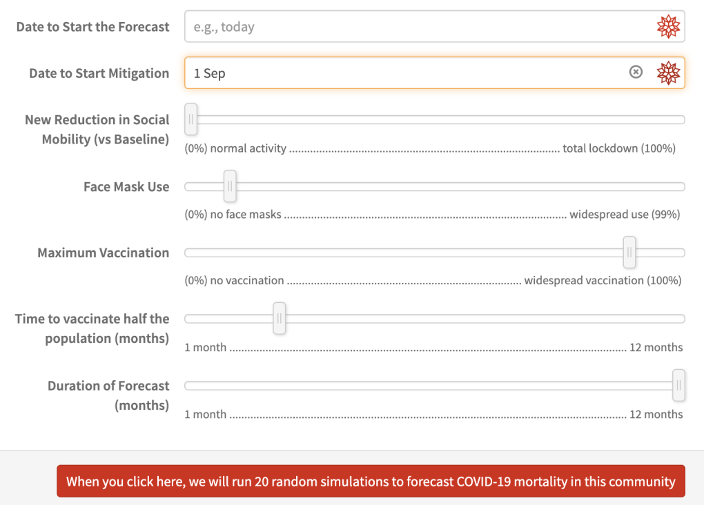
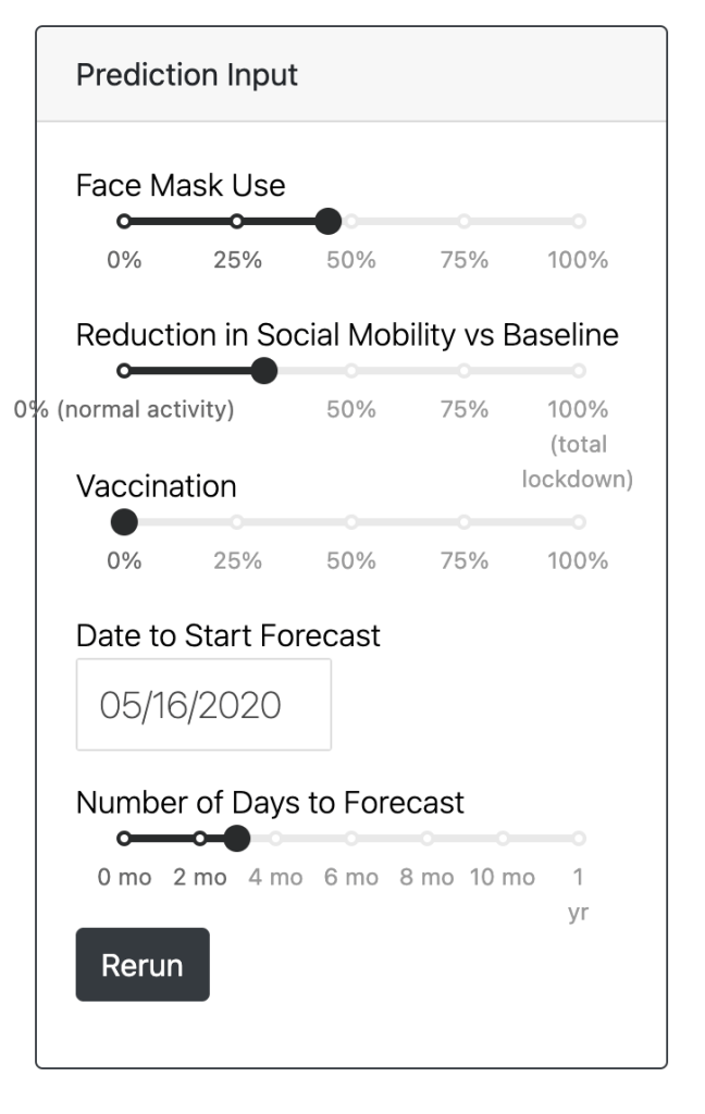
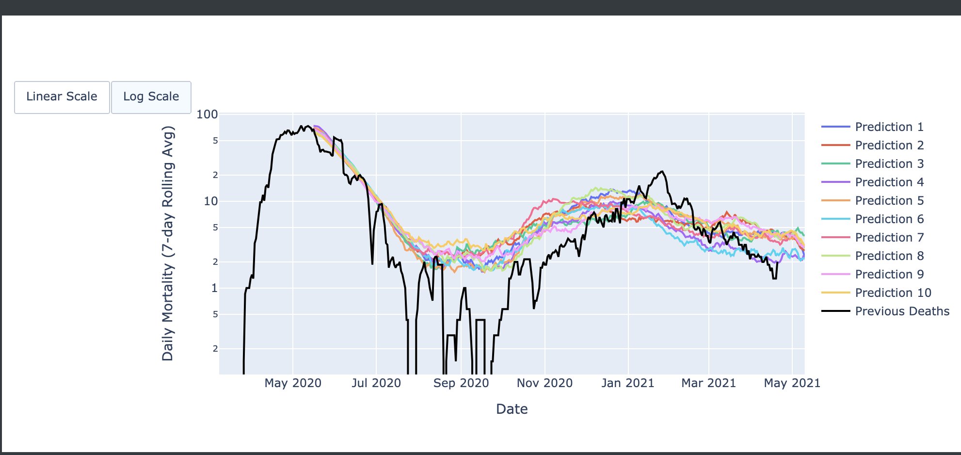
After many months of hard work, we are happy to present “My Local COVID” portal, providing comprehensive tools to track the local COVID epidemic and plan scientific mitigation strategies across US and Canada:
This portal provides resources and tools that could help individuals and policy makers with a scientific, balanced, and evidence-based approach to manage and navigate the COVID-19 Pandemic. It provides historical information, important demographics, and resulting stochastic forecasting for local counties (US) or Health Units (Canada), for adjustable vaccination, face-mask usage and social mobility reduction strategies.
The model is simultaneously calibrated against more than 2500 distinct epidemics and mitigation histories (over 100,000 reproduction number measurements), throughout the course of the COVID-19 pandemic.
Finally, the Canadian portal is here thanks to the hard work of two University of Waterloo undergrads Jolene Zheng and Shafika Olalekan Koiki, and help from Ben Holder. This is work in progress, as is our understanding of COVID, so please help us, help each other, as we are all in this together #covid19pandemic #covid19canada #covid19vaccination #covid19usa
Yoohoo! Matthew has won Canadian Association of Physicists’ 2020 Boris P. Stoicheff Memorial Graduate Scholarship “… for leadership in developing the theory of Bose-Einstein condensates as a novel detector of gravitational waves that would open a new window on the universe for astronomical observations.” and much more.
For the past 3 months, I have been hidden deep in an underground bunker, and this was not just due to the fear of the infection by the novel coronavirus. The COVID-19 pandemic that has locked down much of the world, and taken the lives of half a million people in 3 months, has exposed deep and dangerous gaps in our understanding of the population dynamics, biology, and how we interact with our environment. Our world is suddenly much more dangerous, and draconian measures of centuries gone-by are (justifiably) threatening the freedoms that underpin the viability of modern civil societies, as the price to pay for our health.
But as an Astrophysicist, dabbling in the dark arts (so to speak), is something that comes with the territory. My PhD thesis, back in 2004, was on how we can use subtle correlations of light coming from the big bang with that of galaxies to learn about “The Other 99 Percent”, the dark and mysterious components that dominate the energy of our universe today. Well, we decided to do the same thing with the “Dark Matter of the Disease”! Who are “we”?! Well, my main partner in crime is Ben Holder, a physics professor at Grand Valley State University, who was visiting me on his sabbatical since January. Ben’s most recent research has been on mathematical and computational modeling of infectious disease and viruses, but he had planned to switch to General Relativity and work on Black Hole Echoes, during his sabbatical. Well, let’s just say things didn’t quite go as planned! Along the way, we were joined by Mads Bahrami and Danny Lichtblau from Wolfram Research. Without further ado, here is what we find:
Correlations
So, we looked at 14-day average of daily mortality growth rate, i.e. the exponent of the exponential growth rate as a pan-epidemic, dynamical, measure of infectious spread, across more than 200 US counties, which had available Google Mobility data, as well as enough mortality that we could fit an exponential to. We studied various correlations, but these were the only ones that were independent and significant:
You can clearly see that the reduction in social mobility 2 weeks, or 4 weeks prior to death reduces the growth rate of the disease (hence the positive correlation). This was not a surprise, and the whole point of “lockdown”. The two other significant correlations however, were big surprises: We discovered that the growth rate of the disease is correlated with lived population density (average population density around a typical person) at 7. This, of course, makes sense but was never measured in a meaningful way. Most surprising was the highly significant negative correlation with the total COVID death fraction, suggesting the depletion of susceptibles (or approach to “herd immunity”) as the infection spreads further in a community.
Causation: A Physical Model
We know correlation is not causation. To establish the latter, we need a causal physical model that could explain the current data, and then be used to make predictions. Given the highly unpredictable and random nature of COVID-19 symptoms, we decided to model it as a random walk, starting from exposure at C=0, while you become infectious at C>1 (see below)
It turns out that this simple model, with an age-dependent random walk step sizes, gives a much better fit to the dependence of exponential growth rate on driving factors we discussed above.
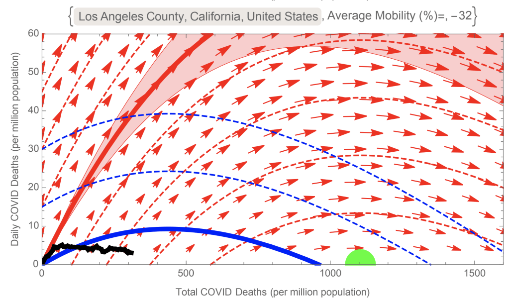
Now we have a predictive model that can be used to forecast where the epidemic can evolve to, depending on the interventions adopted by each community, as well as the intrinsic geography and demography of the community. You can run various possible scenarios for all US counties via our cloud simulator , which we hope can inform current and future policy decisions using actual scientific evidence-based models.
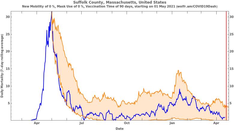
The evolution of epidemic can be visualized via a phase space, showing daily COVID mortality against total COVID mortality. The best-fit model predicts the trajectories in this phase space, depending on social mobility (see below). The red curves are for normal mobility, while the blue curves are for the average mobility for each county since mid-February. The green disc shows the “herd immunity threshold”. For example, we can see that, due to the early onset of the epidemic, New York has overshot the herd immunity threshold, in spite of lockdown. In contrast, Suffolk county (Boston) is heading right towards the threshold, while the LA is far from it, and thus remains highly susceptible to the growth of the epidemic.
Looking at the all US counties, our best fit model suggests that about 9% of US population live in counties which might have passed “herd immunity threshold”. These are shown in the map below (click on the map for PDF version):
My last post, on March 30th, argued for physical modelling of the spread of the pandemic that still continues to dominate our daily lives. I also argued for a universal profile for the pandemic growth, starting with a super-exponential growth at early times (as a superposition of many infection clusters), followed by saturation and decay.
In particular, the best-fit “universal model” to Italy, US, and Canada (on March 29th) predicted that: “… Canadian mortality will pass 1000 around April 9th, while the US mortality will pass 10,000 around April 5th.”
As you can see below, while the latter milestone did indeed come to pass, the Canadian rate has fortunately slowed down since the end of March, and we are so far below 1000 COVID-19 fatalities in Canada.
In fact, exactly how the spread of a contagion slows down was beyond the scope of my last post, but clearly it is what we care about the most as a society. So, given the wealth of data that is available on the spread of COVID-19 across the world, I decided to figure out how the data can tell us when a slow-down might be happening.
There are different ways that different outlets decide to visualize this. Probably one of the better ones is the number of daily confirmed fatalities as a function of time:
While this is a good measure, it still has a few caveats. One obvious caveat is that there could be many deaths that were missed, especially at peaks of outbreaks (e.g., due to death at home), or misidentification of the cause of death. Another caveat is that it is hard to compare different countries, due to their different populations, or different sizes of outbreaks.
A New Measure
To solve the latter problem, I will now introduce the Relative Daily Increase in Reported Death, , which is defined as:
where is the number of daily confirmed death, on day . For example, implies that the number of reported deaths today, is % higher than the number of reported deaths yesterday. To reduce the scatter, I will actually use a rolling average over 14 days, i.e.
For example, /day today means that the number of reported death in the past 7 days (including today) were twice () that of the preceding 7 days.
Of course, what we really need is this number for the infected individuals, but given the arbitrariness and shortcomings in testings across municipalities, and the prevalence of asymptomatic individuals, I think the mortality numbers (even with all its shortcomings) may give a more reliable measure of the epidemic. However, there is clearly a time-delay between the exposure and death, which needs to be taken into account if one wants to relate the mortality statistics to the epidemic dynamics. According to current clinical studies, the incubation period (the period from exposure to onset of symptoms) is 4 to 7 days , while the time from onset of symptoms to death (on average) is 17 to 19 days (both at 95% confidence level). Given my lack of knowledge of how these uncertainties may be correlated, I take the conservative range of 21-26 days, as the expected time delay from exposure to death. Now, since depends on mortality data in the past 14 days, the 21-26 day delay implies that it takes at least21 days for any effect of, e.g., social distancing to show up in , but it may take up to 14+26=40 days to see the full effect.
United States vs. Canada: Comparison of COVID-19 Mortality Growth Rates
So, after all this introduction, the next plot compares between the United States and Canada, where the errorbars are simple Poisson errors.
As I had predicted in my last post, both US and Canada show an early rise in death growth rates, which could be attributed to different competing epidemic clusters. Since US is more geographically diverse, it has a faster rise. However, they both reach a peak, US around March 25th, and Canada around April 9th, following which the rates start to drop precipitously. In fact, it appears that daily death rates might have peaked for both countries in the last couple of days, i.e. , although it may take a few days for it to show up in (if it is indeed real, and not a statistical fluke).
But what is responsible for these precipitous drops in mortality growth rates? The natural response might be that preventative measures, such as lockdowns and social distancing have started to work. To test this hypothesis, we can compare the recently released mobility data from Google, that shows how lockdowns have affected the two countries (I only show the first row of the report, which is representative of the drop in other social activities) .
We notice that the activities in both countries start to drop around March 15th, and take almost a week to reach their plateau. If this drop can mitigate the spread of COVID-19, given the 21-day delay that we discussed above, it should only start to affect the mortality after April 5th, which could well fit the rapid drop in Canadian mortality growth (or ), on April 9th. But what about the US, whose mortality growth peaked on March 25th? For that, the spread of the virus must have slowed down well before March 4th. Even looking at the mobility reports for Washington and New York States, which are respectively the earliest and the biggest US epicenters of the pandemic, show little change in social activities prior to March 8th. More curiously, even though US and Canada started their social distancing around March 15th (even though US’s -49% is not quite as impressive as Canada’s -63%), the precipitous drop in Canadian mortality rate around April 9th, has no counterpart in US’s data (in spite of its much smaller Poisson errors).
Mystery Deepens
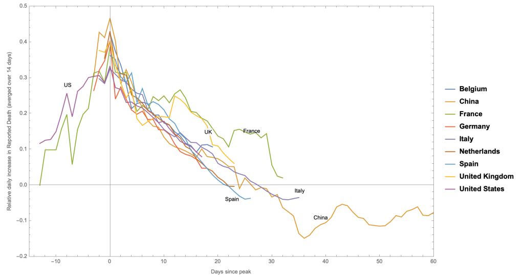
To understand how unique the situation with the US might (or might not) be, I decided to compare it to mortality growth rate, , for other countries. In the next plot, I am comparing this measure for the 9 countries with the highest reported total death (I am excluding Iran here, as its official figures might be a significant underestimate). I have shifted all the curves, so that their peak is at .
Most countries (with the exception of US and France), don’t have much data prior to the peak. This could well be because the epidemic was growing in the dark and under the radar (as it is believed was the case, e.g. in Italy).
More interestingly, it also appears that the mortality growth rates falls precipitously, in essentially an identical fashion to the US, past the peak: They all appear to peak around /day (at 1-), and linearly decrease, with similar slopes that cross zero (i.e. max. daily death) within 21-27 days. The two exceptions are the UK and France that appear to undergo secondary and tertiary outbreaks.
Similar to the US, there appears to be no correlation between the dates of the lockdown (defined as when the social mobility plateaus to its lockdown rate) , and those of the peak mortality rate , no matter how effective the lockdown has been.
“Herd Immunity” vs Lockdown
There is an interesting coincidence between the numbers that we discussed above. The 21-27 days from the peak of to when it crosses zero (i.e. max. daily fatality), which is common amongst the 9 countries with biggest total death (excluding Iran) is identical to the 21-26 days exposure-to-death period, inferred for COVID-19. Therefore, if we are near the peak of the epidemic with /day, i.e. twice as many people are infected tomorrow as they were yesterday, and you suddenly stop the infections today, then most fatalities will happen 21-26 days from today. This would explain the universality of the universal precipitous drop in .
But what would suddenly stop the spread at the peak? As the last plot showed, there doesn’t seem to be an obvious causal relationship between the lockdown and the peak in mortality growth. In fact, one may speculate that the lockdown might be more of a sociological response to large mortality growth. To shed light on this situation, let’s make a comparison between four countries, Canada and Austria (with more effective lockdown starting at small ), USA (with less effective lockdown starting at already large ) and Sweden (with no effective lockdown):
We see that, for Austria and Canada, as we argued above, the rapid drop and small peak at , is a likely (and timely) response to social distancing measures. However, countries with late or no lockdown will reach a universal maximum, until they presumably reach some version of “herd immunity”, at which point the death rate drops in a universal fashion (case in point: US and Sweden curves are indistinguishable beyond the peak, despite vastly different populations). The problem with “herd immunity”, however, is that it may need to happen over and over again, within different communities in a country, as it seems to be happening in France and the UK.
Bottom Line
At this point, if you managed to make it this far (congratulations by the way! you are excellent at extreme social distancing👏), you may have hoped to find one concise conclusion. I am afraid to disappoint you!
I guess one lesson might be that you may always learn new things by plotting different statistical measures of a physical phenomenon, including a pandemic. I also think the universal behavior of mortality growth rate, as I have defined here, at least with countries with large number of deaths was a surprise to me, and something that I hadn’t seen anywhere else. I also believe the existence of a dark onset of epidemic for most countries in Europe and China (having missed the early rise), might be another lesson from these plots. As to the most important question, i.e. the role of “herd immunity” vs. “lockdown”, it appears hard to distinguish the two possibilities, as they both appear to happen around the peaks of a pandemic in a community. However, countries with poorer and/or later lockdowns appear to see higher peaks and/or slower decays of the mortality growth rate (translating to a larger overall fatality per capita). Ultimately though, this is intimately related to the prevalence of asymptomatic and undetected spreaders, the more of them around, the less fatal is COVID-19 and we reach “herd immunity” faster, while an effective lockdown and contact tracing will become harder.
In the end, let me thank Ghazal Geshnizjani, Ben Holder and Bruce Bassett for many useful discussions. In particular, Bruce has some excellent analysis on data science with COVID-19 that can be found on his Linked-In Page.
Update (April 14th, at 9:12am EDT): The last figure was updated to include Austria (a similar sized country to Sweden), as was suggested by Ghazal Geshnizjani.
These are strange times, the likes of which we probably see once in a generation, and it is amazing that it is happening across the world simultaneously, and in the age of internet. As physicists, as much as one would like to carry on , it is hard to ignore what is going on around you, and try to understand it, the same way we understand any other physical system. So here it goes:
A Growth+Diffusion Model for Early Epidemic
As we approach any other physics problem, we start from first principles that describe the system of interest. For the purpose of this note, I will start by describing how how a contagion is transmitted within a community and spreads across large geographical locations. What bothers me about the standard treatments (e.g., the SIR equation) is that, by reducing the system to ordinary differential equations, it ignores this geographical diversity and thus (as we shall see below) might miss important phenomenological features of the evolution.
Instead, I will use an inhomogeneous linear growth+diffusion equation to describe the early phase of an epidemic, prior to large-scale immunity or social intervention:
Here n(x,t) is the number density of infected individuals as a function of space and time. R(x) is the local linear growth rate (= ln(2) divided by the doubling time), while D(x) is a diffusion coefficient, quantifying how infected individuals can move around. Since the coefficients don’t have explicit time-dependence, we can decompose the solution into modes with exponential growth (or decay):
where ‘s and ‘s are eigenvalues and eingenstates of the elliptic operator :
For constant D, this is the same equation as energy states of a particle in 2D that satisfies time-independent Schrodinger Equation:
For example, one result that we can now use is that for generic random potentials (or disorder) in 2D the eigenstates are localized, otherwise known as Anderson localization. One can think of these different localized eigenstates as localized communities with different doubling times for the growth of the epidemic.
The next physics result we shall use is the probability distribution of spacing of energy states of a random potential, known as Wigner surmise:
which we shall use to quantify the distribution of the largest eigenvalue (equivalent to the energy of the most energy bound state). Plugging this into Equation (2) yields:
Now, for large and , we would like to use saddle approximation compute this integral. To do this, we have to expand to second order in , i.e. where we assume , otherwise the integral would diverge (or we need to include more terms). The saddle-point approximation for large times yields:
In other words, we predict a super-exponential growth at early times, which is contrast to the exponential expectation from simple uniform models, such as the SIR equation. The reason for this is clearly that we are dealing with a distribution of growth rates, and the later times will be dominated by populations with faster growth rates (smallest doubling time), no matter how small they start.
One clear limitation of Equation (8), apart that it only applies to the linear regime and no interventions, is that at some point we will be dominated by the community with the largest eigenvalue, at which point the exponent should become linear time. This will be followed by further nonlinear effects. I will include these effects, by terms that are higher order in time, i.e.
Comparison to Data
We shall next try to fit this to fatality data for different countries, up until March 29th, 2020 (using data provided by https://ourworldindata.org/coronavirus). We find the best fit parameters:
and . However, these parameters are highly degenerate, as can be seen in the 1 and 2 contours
Best fit parameters for US (blue), Canada (red) data, and Italy (green) as of March 29, 2020. There is just over evidence for the cubic term in US data, which means that can describe most of US data. The Canadian parameters are more poorly constrained, but appear perfectly consistent with those of the US. The Italian parameters, are considerably better constrained but still consistent with the two other countries (but see below).
In fact, including the cubic terms only became necessary in the last 3 days to fit the US data. Furthermore, the Canadian parameters are perfectly consistent with those of US, but with larger errors.
Some comments on fitting the data: The most rigorous way to fit the data (assuming that you have a perfect model) is to fit daily values using Poisson statistics, as they are independent. Using this, our best fit to US, Canada, and Italy data gives and respectively. I interpret this as data not being completely uncorrelated, as expected, since infection happens in clusters. As such, for parameter estimation I divide the Poisson log-likelihood by to reflect this sample variance.
The next figure shows the logarithmic derivative for US, Canada, Italy, and South Korea. While for the US and Canada, t=1 is the report of first death, the Italy data is shifted forward by 25 days from the day of first death. The best curve fit is to the US data, but clearly fits both Canada and Italy (after the shift), as the parameters are consistent at 95% confidence level, per the figure above.
I have also added South Korean data, but shifted by 40 days. While the US best-fit, extrapolated forward can fit well the first 20 days of S Korean dat, it clearly misses the second half. However, it could well be that higher order terms in the exponent of Equation (9) will become important at this point.
Logarithmic derivative of the total fatality for US (blue), Canada (red), Italy (green), and South Korea (black), as of March 29th. For US and Canada, t=1 is at the report of first death, while the data for Italy and South Korea are shifted forward by 25 and 40 days, respectively. The curve shows the best fit to US data.
This plot is of course very suggestive. Could there be a universal as a function of time (analogous to Hubble constant H(t), or Friedmann equation, in cosmology)? This may suggest the intriguing possibility that the true onset of the Italian (South Korean) epidemic might have been 25 (40) days before the first death was attributed to the Covid-19 epidemic. Of course, the alternative is that there is no universality, and the different behaviors are dictated by environmental and social factors.
Final Note
Finally, let me end on a somber note: The best-fit model (to US, Canada, and Italy) predicts that Canadian mortality will pass 1000 around April 9th, while the US mortality will pass 10,000 around April 5th. I will not dare extrapolate beyond that point, and I sincerely hope that the model is wrong.


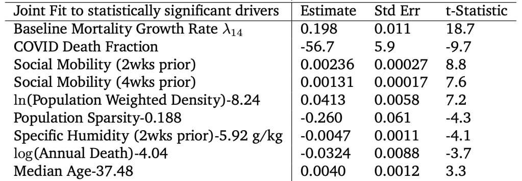
 . This, of course, makes sense but was never measured in a meaningful way. Most surprising was the highly significant
  negative correlation with the total COVID death fraction, suggesting the depletion of susceptibles (or approach to “herd immunity”) as the infection spreads further in a community.
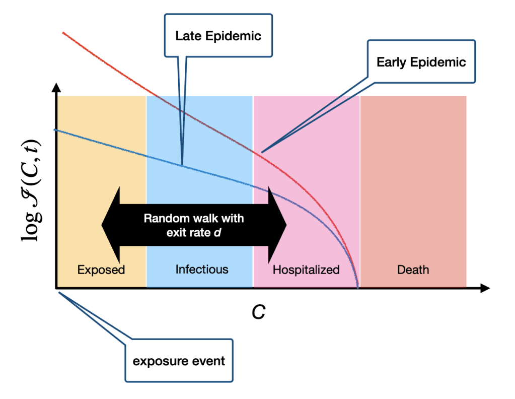


 , which is defined as:
 is the number of daily confirmed death, on day
  . For example,
  implies that the number of reported deaths today, is
  % higher than the number of reported deaths yesterday. To reduce the scatter, I will actually use a rolling average over 14 days, i.e.
 /day today means that the number of reported death in the past 7 days (including today) were twice (
 ) that of the preceding 7 days.
  depends on mortality data in the past 14 days, the 21-26 day delay implies that it takes at least 21 days for any effect of, e.g., social distancing to show up in
 , although it may take a few days for it to show up in

 .
. 
 /day (at 1-
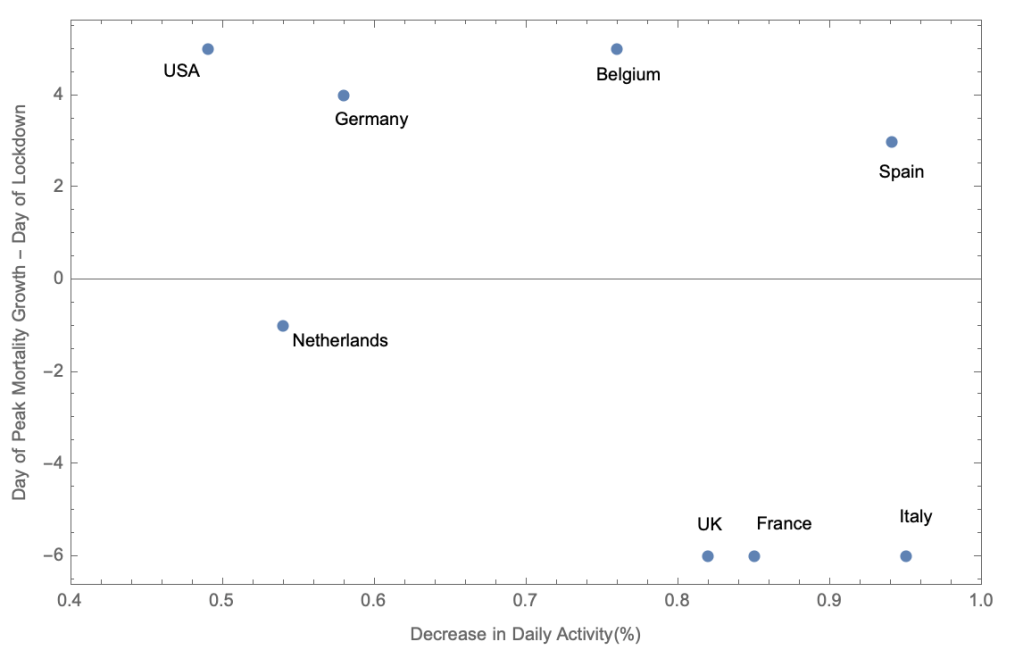
 /day, i.e. twice as many people are infected tomorrow as they were yesterday, and you suddenly stop the infections today, then most fatalities will happen 21-26 days from today. This would explain the universality of the universal precipitous drop in
 , is a likely (and timely) response to social distancing measures. However, countries with late or no lockdown will reach a universal maximum, until they presumably reach some version of “herd immunity”, at which point the death rate drops in a universal fashion (case in point: US and Sweden curves are indistinguishable beyond the peak, despite vastly different populations). The problem with “herd immunity”, however, is that it may need to happen over and over again, within different communities in a country, as it seems to be happening in France and the UK.

 ‘s and
  ‘s are eigenvalues and eingenstates of the elliptic operator
  :
: 


 and
and  to second order in
  where we assume
  , otherwise the integral would diverge (or we need to include more terms). The saddle-point approximation for large times yields:

 and
and  . However, these parameters are highly degenerate, as can be seen in the 1 and 2
 evidence for the cubic term in US data, which means that
  can describe most of US data. The Canadian parameters are more poorly constrained, but appear perfectly consistent with those of the US. The Italian parameters, are considerably better constrained but still consistent with the two other countries (but see below).
  and
and  respectively. I interpret this as data not being completely uncorrelated, as expected, since infection happens in clusters. As such, for parameter estimation I divide the Poisson log-likelihood by
  to reflect this sample variance.
 for US, Canada, Italy, and South Korea. While for the US and Canada, t=1 is the report of first death, the Italy data is shifted forward by 25 days from the day of first death. The best curve fit is to the US data, but clearly fits both Canada and Italy (after the shift), as the parameters are consistent at 95% confidence level, per the figure above.
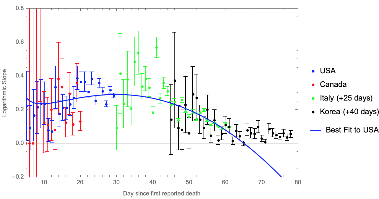
 for US (blue), Canada (red), Italy (green), and South Korea (black), as of March 29th. For US and Canada, t=1 is at the report of first death, while the data for Italy and South Korea are shifted forward by 25 and 40 days, respectively. The curve shows the best fit to US data.
You must be logged in to post a comment.