Diverse Drivers of a Pandemic: A Physical Model for COVID-19
2020-07-02
For the past 3 months, I have been hidden deep in an underground bunker, and this was not just due to the fear of the infection by the novel coronavirus. The COVID-19 pandemic that has locked down much of the world, and taken the lives of half a million people in 3 months, has exposed deep and dangerous gaps in our understanding of the population dynamics, biology, and how we interact with our environment. Our world is suddenly much more dangerous, and draconian measures of centuries gone-by are (justifiably) threatening the freedoms that underpin the viability of modern civil societies, as the price to pay for our health.
But as an Astrophysicist, dabbling in the dark arts (so to speak), is something that comes with the territory. My PhD thesis, back in 2004, was on how we can use subtle correlations of light coming from the big bang with that of galaxies to learn about "The Other 99 Percent", the dark and mysterious components that dominate the energy of our universe today. Well, we decided to do the same thing with the "Dark Matter of the Disease"! Who are "we"?! Well, my main partner in crime is Ben Holder, a physics professor at Grand Valley State University, who was visiting me on his sabbatical since January. Ben's most recent research has been on mathematical and computational modeling of infectious disease and viruses, but he had planned to switch to General Relativity and work on Black Hole Echoes, during his sabbatical. Well, let's just say things didn't quite go as planned! Along the way, we were joined by Mads Bahrami and Danny Lichtblau from Wolfram Research. Without further ado, here is what we find:
Correlations
So, we looked at 14-day average of daily mortality growth rate, i.e. the exponent of the exponential growth rate as a pan-epidemic, dynamical, measure of infectious spread, across more than 200 US counties, which had available Google Mobility data, as well as enough mortality that we could fit an exponential to. We studied various correlations, but these were the only ones that were independent and significant:
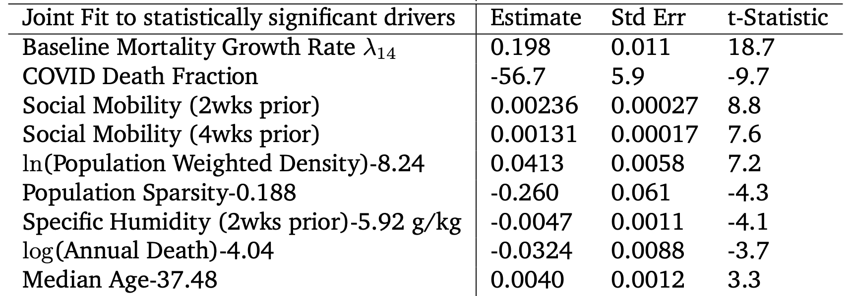
You can clearly see that the reduction in social mobility 2 weeks, or 4 weeks prior to death reduces the growth rate of the disease (hence the positive correlation). This was not a surprise, and the whole point of "lockdown". The two other significant correlations however, were big surprises: We discovered that the growth rate of the disease is correlated with lived population density (average population density around a typical person) at 7$latex \sigma$. This, of course, makes sense but was never measured in a meaningful way. Most surprising was the highly significant $latex 10 \sigma$ negative correlation with the total COVID death fraction, suggesting the depletion of susceptibles (or approach to "herd immunity") as the infection spreads further in a community.
Causation: A Physical Model
We know correlation is not causation. To establish the latter, we need a causal physical model that could explain the current data, and then be used to make predictions. Given the highly unpredictable and random nature of COVID-19 symptoms, we decided to model it as a random walk, starting from exposure at C=0, while you become infectious at C>1 (see below)
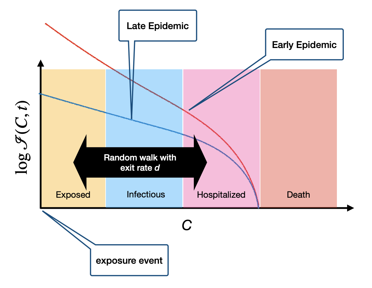
It turns out that this simple model, with an age-dependent random walk step sizes, gives a much better fit to the dependence of exponential growth rate on driving factors we discussed above.
Now we have a predictive model that can be used to forecast where the epidemic can evolve to, depending on the interventions adopted by each community, as well as the intrinsic geography and demography of the community. You can run various possible scenarios for all US counties via our cloud simulator , which we hope can inform current and future policy decisions using actual scientific evidence-based models.
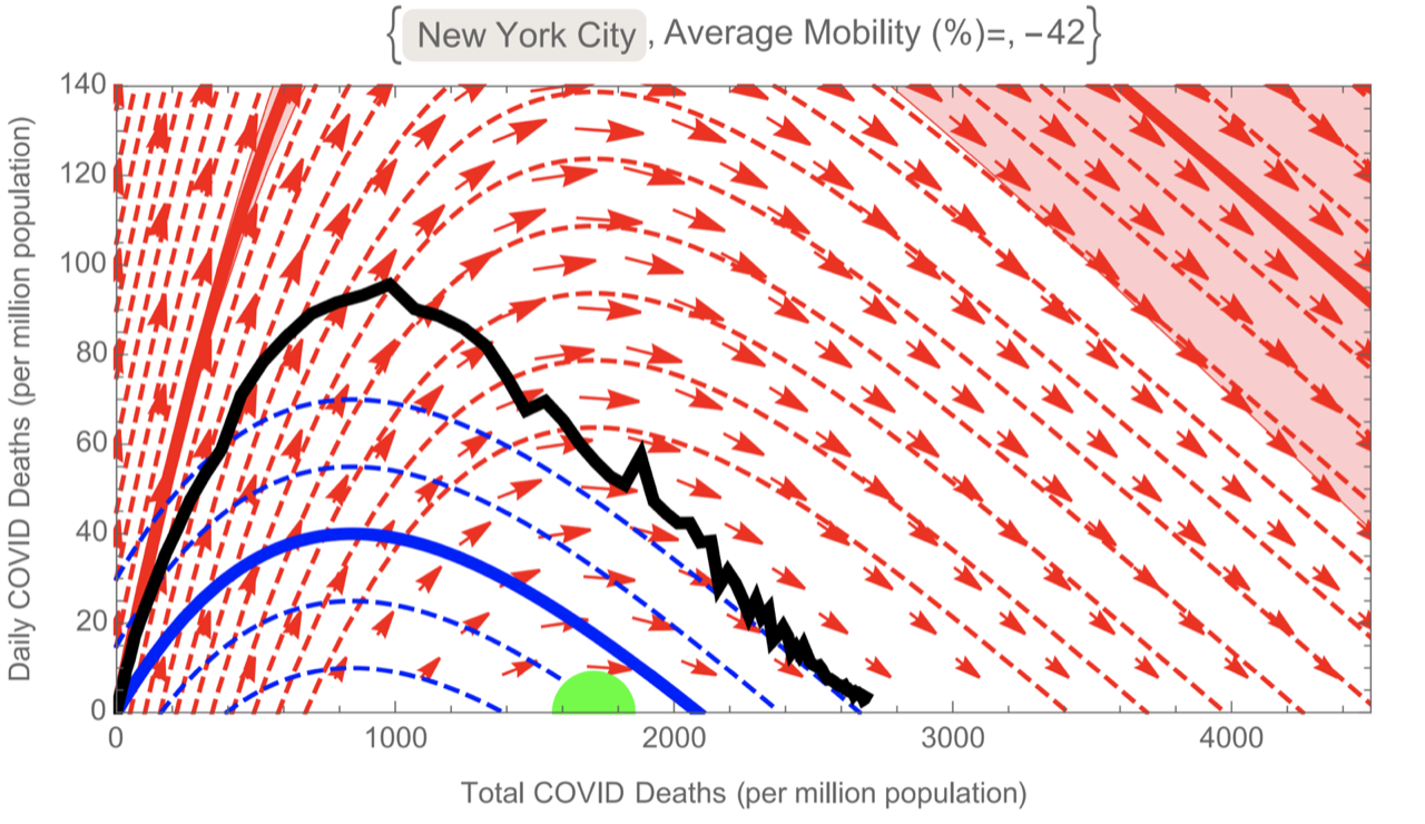
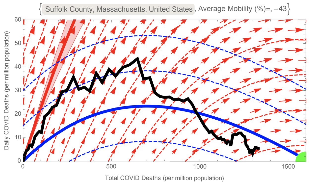
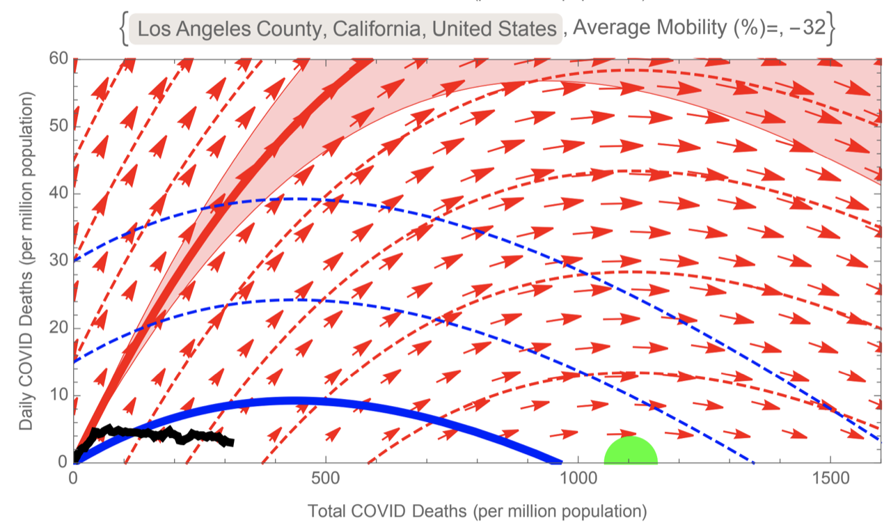
The evolution of epidemic can be visualized via a phase space, showing daily COVID mortality against total COVID mortality. The best-fit model predicts the trajectories in this phase space, depending on social mobility (see below). The red curves are for normal mobility, while the blue curves are for the average mobility for each county since mid-February. The green disc shows the "herd immunity threshold". For example, we can see that, due to the early onset of the epidemic, New York has overshot the herd immunity threshold, in spite of lockdown. In contrast, Suffolk county (Boston) is heading right towards the threshold, while the LA is far from it, and thus remains highly susceptible to the growth of the epidemic.
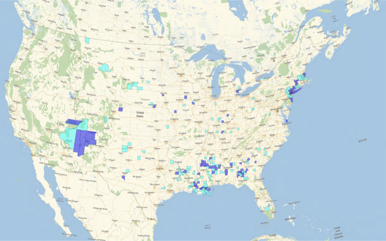
Looking at the all US counties, our best fit model suggests that about 9% of US population live in counties which might have passed "herd immunity threshold". These are shown in the map below (click on the map for PDF version):
Further Reading
Our paper on arXiv: https://arxiv.org/abs/2007.00159
Our paper on medRxiv: https://www.medrxiv.org/content/10.1101/2020.06.30.20143636v1
Covid maps and resources: /covid/
Our online cloud simulator: https://wolfr.am/COVID19Dash