Technical Notes and Publications
- Lived-Area and Lived-Population Density (by Mads Bahrami; Nov. 2020)
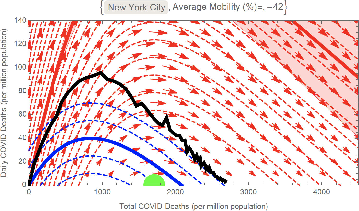
- Diverse Drivers of a Pandemic: A Physical Model for COVID-19 (blog post; July 2020)
- Diverse local epidemics reveal the distinct effects of population density, demographics, climate, depletion of susceptibles, and intervention in the first wave of COVID-19 in the United States (arXiv preprint; July 2020)
- Physical Measure of a Pandemic (blog post; Apr 2020)
- Physical Modelling of a Pandemic (blog post; Mar 2020)